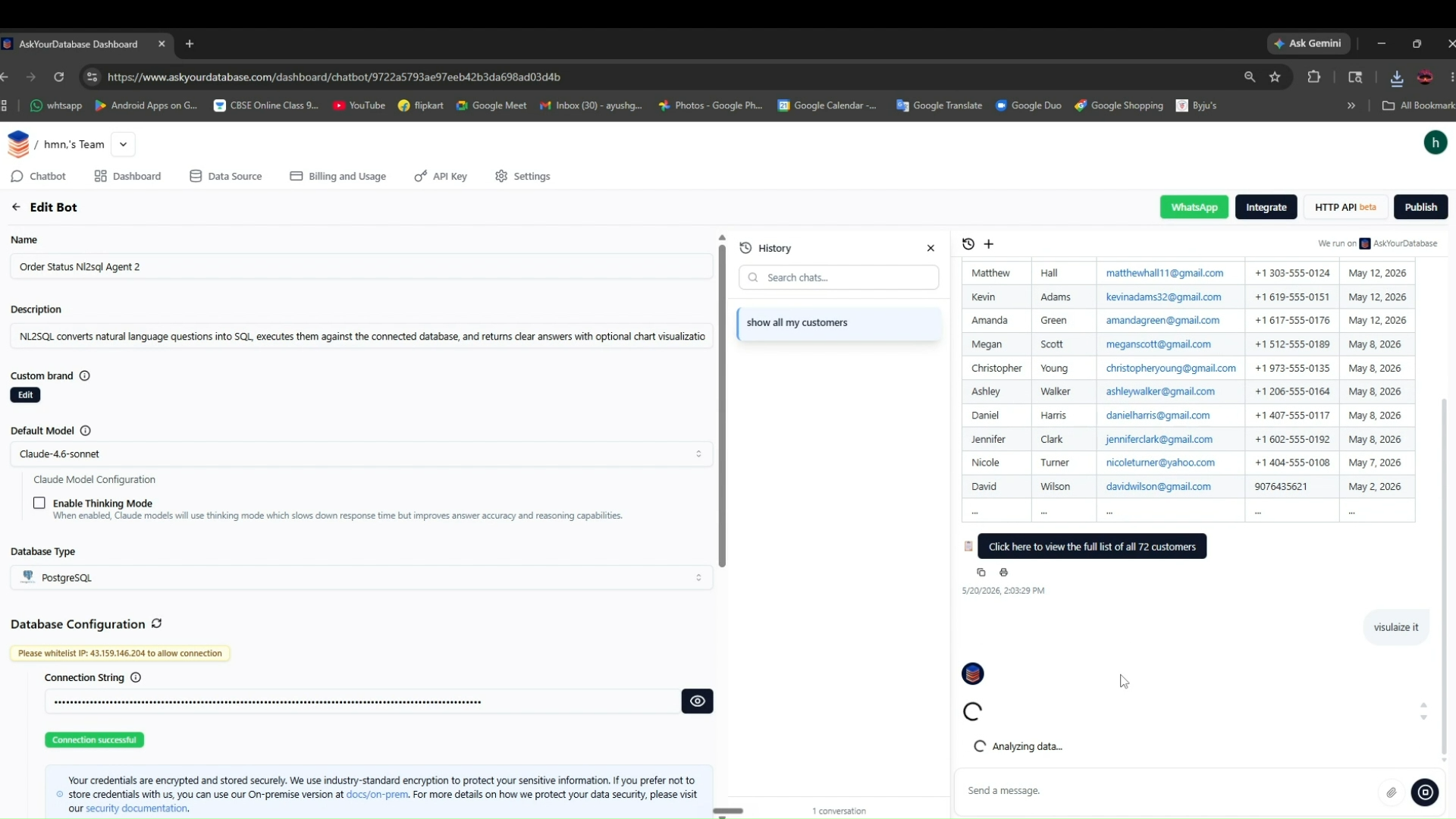
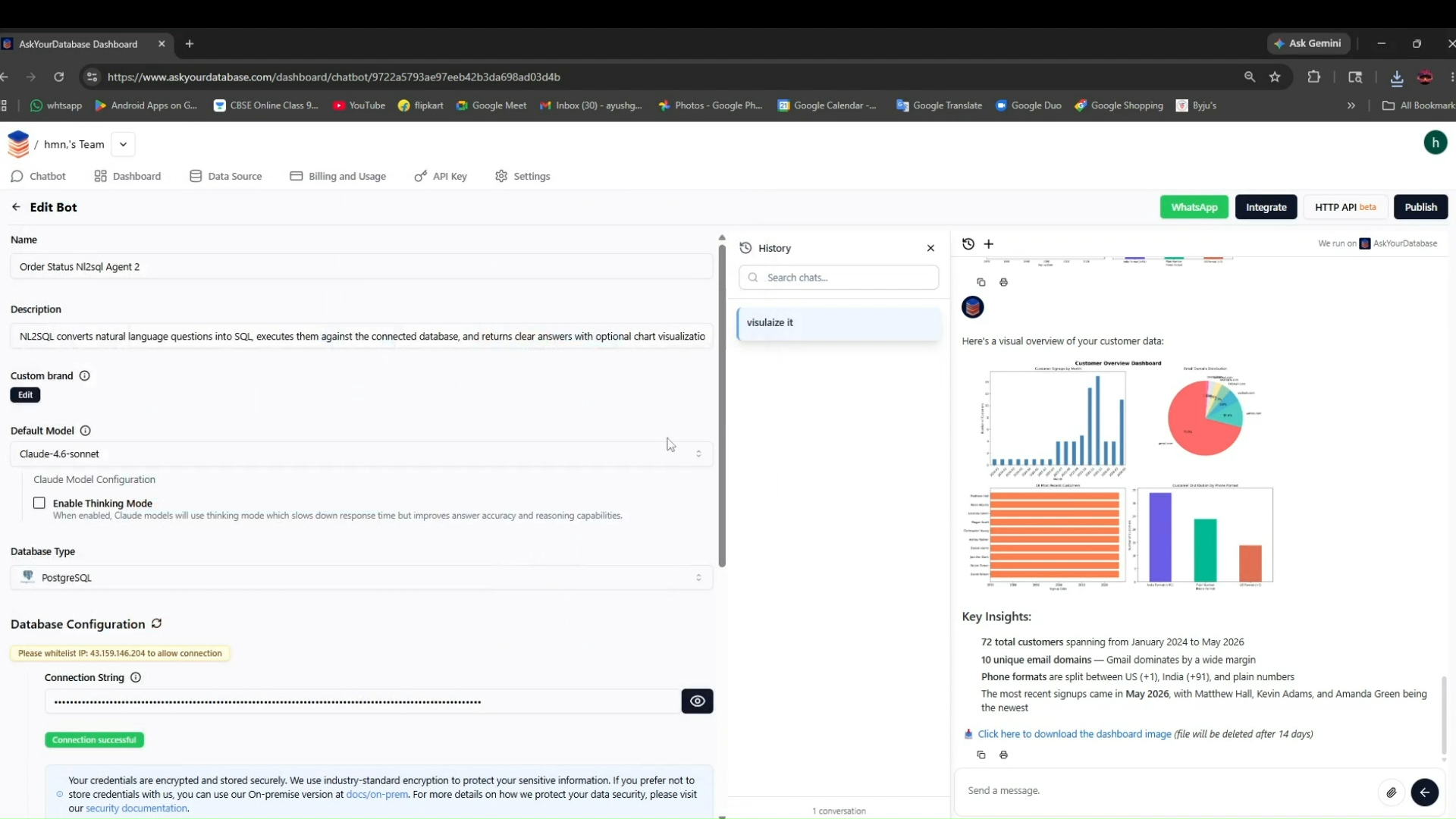
Visualization was not automatic; the report says the tool only produced a visual after an explicit follow-up prompt, so charts were not auto-generated on the initial answers.
What was measured
Chart / Visualization Support
Does it generate charts automatically or allow useful visual views?
capability
What was given, what came back
Test input: Order pipeline breakdown with paid-pending edge case and last-month comparison · text · group: ecommerce-nl2sql-benchmark
Input — what we sent
The exact prompt
How many orders do we have at each stage right now?

Follow-up 1: What percentage of our orders were successfully delivered vs cancelled?

Follow-up 2: Are there any orders that are pending but already paid?

Follow-up 3: Compare that to last month — same breakdown, I want to see if things have improved or got worse.
A deeper operational analysis of current order stages, delivery-versus-cancellation rates, pending-but-paid edge cases, and a month-over-month comparison of the same breakdown.
Why this input is hard
- · Order pipeline analysis
- · Percentage calculation
- · Edge-case detection
- · Payment/order status joins
- · Multi-turn context retention
- · Month-over-month comparison
- · Ambiguity handling for 'same breakdown'
Output — unretouched
Also checked on this input — same tool, 11 other criteria
Ambiguity Handling✓ WorkedClarified 'last month' upfront as April 20, 2026 before running the comparison, rather than guessing what period the user meant.Business Insight✓ WorkedTurned the comparison into a business judgment by stating that the backlog fell from 13 stuck orders to 2, an 85% reduction that 'improved significantly'.Business Insight✓ WorkedThe tool added operational context by flagging the two oldest pending-but-paid orders as needing manual intervention.Business Insight✓ WorkedThe follow-up summaries explained what the raw counts meant operationally, including delivery/cancellation rates and the backlog reduction story.Follow-Up Context◐ MixedThe tool retained the immediately preceding pending-paid edge-case context, but the report says it used that narrower metric for the follow-up comparison instead of the full original stage breakdown.Plain English Query Handling✓ WorkedAccepted a four-step operational analysis in plain English across the full follow-up chain without needing the user to write SQL.Plain English Query Handling✓ WorkedThe tool correctly handled a multi-step operational conversation without requiring structured SQL from the user at each turn.Result Readability✓ WorkedThe pipeline output was readable because it summarized counts, percentages, and the stuck-versus-resolved comparison in plain tables and short callouts.Result Readability✓ WorkedReturned a clean 7-row status table with 93 total orders and an easy-to-scan delivered-versus-cancelled percentage summary.SQL Generation✓ WorkedHandled the month-over-month follow-up with multiple SQL statements to compare the current snapshot, inspect paid-but-pending orders, and build the prior-month comparison.SQL Visibility✓ WorkedShowed the SQL used for each step instead of only presenting the final answer.
Provenance
- Observation
- 202b6ee0-0279-474b-883d-4d71f83eeea7
- Evidence run
- db2bb5d5-0e0e-4cb3-8d76-3555c45c23cd
- Study
- Query Live Databases Using Plain English with AI
- Research task
- 86b9y6c99
- Tested at
- not recorded
- Source
- first-party
- Evidence state
- verified
- Proof shown
- input + output shown
- Cost / latency
- not captured
- Repeat run
- not captured
- Tester
- not captured
The last three rows are honest blanks, not placeholders — our capture has no field for them yet.
Query this
get_evidence({
  tool: "askyourdatabase",
  scenario: "ecommerce-nl2sql-benchmark"
})
MCP · mcp.aidemos.com/api/mcp
Free with attribution.
Same input, same check — 3 other tools
measured on Chart / Visualization Support
Definite◐ MixedCharts were not generated automatically in the chat; the report says an extra prompt was needed before Definite created a separate dashboard/doc, and the dashboard view shows an 'Orders By Stage' summary with a donut chart.Draxlr✓ WorkedCan auto-generate a correct chart for a simple month-over-month comparison, showing Last Month at 11 pending-paid orders versus Current Month at 20.Querio✓ WorkedAutomatically generates chart views for the order-stage breakdown and the delivered-vs-cancelled comparison, including the month-over-month share chart.
This evidence is published in
From the same study (page rebuilt from a later run)
Real inputs and real outputs, no retouching · every cell queryable via API & MCP · aidemos.com